Saturday, 21 April 2012

AD201 - Blog SWOT Analysis

Strengths -
  • What strengths did I have? - My strengths were spending a lot of time putting my own information onto my blog, with weekly updates on each project.
  • What do people see as my strengths? - My strengths seemed to be in the blog, gathering all the information and spending a lot of time creating it.
  • Which of my achievements am I most proud of? - I am most proud of completing the blog, updating it on a weekly basis and and being able to see how far I have came on
  • each project by doing this.
  • Which section of the work did I complete well? - I completed the overall blog well, spending most of my time on it rather than the file side and taking photos of my own to put onto my blog to help me with my aims and objectives for the weeks.
Weaknesses-
  • What tasks did I avoid? - I mostly avoided the written and file side of the project as I felt most comfortable spending a lot of the time on the blog as I feel I am better at the creative part than the written part.
  • What do others see as my weaknesses? - My weakness seemed to be again, not spending enough time on the blog file and putting all of my concentration into the blog.
  • What held me back? - What held me back was my lack of knowledge on how to go about doing certain tasks for the project and being unsure on what to include in both the file and blog.
  • What are my negative work habits? - My negative work habits were again focusing my time on the blog rather than the file.

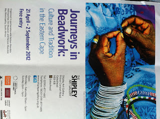
Shipley Art Gallery - Journeys In Beadwork Exhibition Review

Journeys in beadwork: contemporary and tradition in the Eastern Cape explores the history of beadwork of the Mfengu tribe in South Africa and beadwork in contemporary fashion.
In the culture and tradition in the Eastern Cape part of the exhibition, it celebrates the beadwork of 19th century South Africa and how it has became an integral part of their life. The beadwork in this part of the world is very diverse, inventive, delicate and handmade and features a lot of blue, red, green, white, yellow and orange tones being used as decoration on black and white clothing.
The beadwork is very extravagant and mainly used on head scarves and aprons, showing solidarity to ones community. They incorporate their own style into the beadwork and no two collars were ever made the same. Jewellery embellishment was also a big part of their lifestyle as beads were given to boys that teenage girls were attracted to, showing a sign of affection to them. With this, the beadwork had to be returned if the relationship broke down. Beautiful beaded ties were worn on special occasions and became popular in the 1980’s with the same African beadwork. The beads that were commonly used were nacre and seed beads which were sewn onto black cotton to create the intrinsic, bold patterns. Marriage wear consisted heavily of extravagant beadwork which featured over 70 pieces on one gown and candles or paraffin lamps were often used to light the intricate work. Long strands of beads called ‘isidanga’ would hang to the knees as part of a dance celebration in the African culture and now elements are being integrated into fashion which are made by Nelson Mandela’s bay beadwork group.
In the contemporary part of the exhibition, it features designers work such as YSL, John Galliano and John Paul Gaultier who are inspired by traditional clothing, patterns and designs from Africa. In this part of the exhibition, it shows how the patterns and colours have been taken from the African culture and recreated into modern pieces of work. Patricia Mbela from Africa’s fashion work is shown who was inspired by her childhood experience of a journey she took. Her collection consisted of blues and whites of the mountains and yellows and oranges of the African sunlight. Her embellishment features very heavily on the long strands of beads overlapped on the white cotton to create that similar effect used by the Africans. Again, modern handmade jewellery has been created by Fabienne Morel of Switzerland, who took inspiration from club culture and urban landscapes mixed with the traditional African beadwork. Her work features the same colourings and diagonal line patterns used in 19th century Africa. Buki Akib of London, also featured his fashion collection at the exhibition who was inspired by Nigerian music and the afrobeat movement. His work is very bold and extravagant and features a heavy multi coloured jacket with flamboyant tassels bunched together at the shoulders to create a very dramatic effect. Gold and purple hues were featured alongside geometric patterns and trousers which mirrored the same shape of the African yemba beaded apron creating a very bold statement, showing where he has gained his inspiration from. Lisa Folawiyo of Nigeria was yet another one to show her fashion collection and her embellished Ankara textiles. The fabrics she used were West African and dyed with beads, sequins and crystals embellished on which took 120-240 hours to make. Her spring/summer 2012 collection was inspired by Nigerian photographer Okhai Ojeikere who created 1960’s portraits where she revisited the past and reinterpreted traditional fabrics into modern female silhouettes. Her embellishment is extremely intrinsic and stunning and she has cleverly recreated the same patterns of Africa in her simple yet effective, diagonal beadwork.
Overall, I really got the feel of the hours and effort that was put into the African beadwork in the 19th century and how it can be took to recreate some beautiful, modern fashion garments.


Thursday, 19 April 2012

FMP, Week 14 Cont..

Over the past few days, I have tried multiple ways of adding
colour placement onto my final line up sheets for my final major project.
From the beginning, I knew I didn't want to go down the
colour blocking route so I began colouring certain
parts of the garments. I dont feel this was very effective so began
adding subtle colouring along the edges of the garment to create
the effect of light. I really like the effect this creates although felt that
it didn't quite stand out enough.
From this, I decided to draw the illustrations up on Illustrator
to create a thick black outline around the model and garment
and adding the same subtle colouring onto it once completed.
I feel it stands out a lot and I'm really pleased with the outcome!
Now to make them A3!

Attempt 1

Attempt 2

Attempt 3 - Final ones!


Wednesday, 18 April 2012

Christian Dior A/W 2012

For autumn/winter 2012, Christian Dior, yet again created a collection to die for.
With John Galliano now out the scene, for the second time it was left to
Bill Gaytten to create the collection!
The collection which was inspired by Diors masculine tailoring with a combination
of femininity featuring a black, red and soft pink colour palette.
Keeping with the famous Dior silhouette, floaty, thick pleated skirts and
curved silhouettes strode down the catwalk.
Mid length tutu's, clinched waists and ribbon tie shoes brought out the
femininity of the collection clashing with the draped leather and embroidery on
long evening coats bringing out the masculinity and the tougher edge to the collection.
Even simple black long sleeve tops were brought to life with jewels
embellished along the necklines giving a very minimal look to some garments.
The collection is very gentle yet eye catching and now time will
only tell what 2013 will hold for Dior with its new designer, Raf Simons!


Images from Style.com

Check out the catwalk video below!:
Video from Youtube.com


Tuesday, 17 April 2012

FMP, Week 14.

After multiple times of continuously looking over my mood boards on ways
to improve the layouts, I am finally pleased with the results!
I added drawings and images such as French stamps and the Eiffel tower
to try and create a mood on the boards to reflect my chosen theme.
I created a colour board to show the colours that would be
used in my collection, which I chose very natural colours such as creams, white, navys, greys and black to give an essence of the famous 'white and navy' French colour pallette.
To fill a space in my portfolio, I found it neccessary to include a
board on Coco Chanel and her design work, being the most famous designer
to come out of Paris, and her take on Parisian Chic.
Within this, I found she used/uses a lot of heavy embellishment
in her work which I have also recreated in my own final garment.
Today, I have began concentrating on my colour placement technique on my
final line ups. As I find this to be a weakness, I decided it was a good idea
to photocopy the line up sheets to do colour testing before I started on the real sheets
so they dont become ruined!
My intention was to create a subtle hint at the colour and not to create a
colour blocking look to it. I feel this worked well on the final design sheet
as the illustration was created using Adobe Illustrator and the colour
sits really well with the dark outline.
When doing the same on the line up sheets I didnt feel it created the
same effect so have decided to scan in the sheets and create them on CAD!
And theres me thinking I wasnt going to have to use it again!

With my dress, I have decided to create and design a hat to go with it!
I gained inspiration to do this from one of my tutors, Jill, who creates and sells
hats/fascinators, who agreed to help me create one and teach me the trade
after viewing my final line up styling.
Excited to start hat making! 

New Contemporary Theme Board

New Historical Theme Board

New Colour Board

Chanel Board

Final Design Board

Line ups and Colour Placement Testing

Monday, 16 April 2012

Work Placement - Fashion Show Final Poster.

Week 7
  • Had a meeting with Lily about work produced over easter – loved my poster and written text – emailed everyone the writing edited, changed rotation of it and sent it to everyone – changed date to June 11th – added 'the white show – foundation degree students presents their final year fashion show' in the multicoloured text (with difficulty!) and put address under contact information
  • Emailed a copy of the final poster to Lily to get some printed off to put around Newcastle city centre and around college to promote the show
  • Looked through model research – found about 5 models that will definitely do it – need 30. - keep looking, ask students to use models they used for their photoshoot
  • Contact graphic students to refine poster?
  • Started looking through lists of what we need sorted and who will sort it out –
models – Rachel
music – Claire
lighting – group – ask photography students
filming – contact media department
hair and make up – need 3/4– Michelle and Claire
photographer – contact photography students
runway – drama department – Claire
visuals and decorations – myself and Lilly
accessories – students and models own
flowers – Lily
refreshments – Marisa
Final Poster!


Sunday, 8 April 2012

Chanel S/S RTW 2012 Collection

For Spring/Summer 2012, Chanel yet again delivered another spectacular show.
With performer Florence and the Machine arising from a shell,
the magic of the underwater world was created.
It seemed impossible to take everything in during the show
and Lagerfeld's light, white, exquisite garments were
blinding on the runway.
Boxy tweeds, drop waists and pleats were all featured in the
collection, giving a sense of prettiness to it. There were pearls
around the waists of the models which were used instead of belts
to again reflect the water theme.
Swarovski pearls were dotted along the brows, ears, hair 
and spines of the models, giving a 'mother of pearl'
shimmer to the collection.

Chanel Spring 2012 Ready-to-Wear
Images from style.com

Check out the video below of the show:
Video from Youtube.com

Saturday, 7 April 2012

AD206 Styling Project SWOT Analysis.

Strengths -
·        What strengths did I have that others don’t? – My strengths were my time keeping, keeping a weekly diary which helped when evaluating the project and being persistent with the photographer.
·        What do people see as my strengths? – My time keeping was a strength, allowing me to finish the project before hand in, coming to decisions quickly and working well with other professionals to get the best results.
·        Which of my achievements am I most proud of? – I am most proud of the final range of images, from the styling to the location which I feel really show my theme well.
·        Which section of the work did I complete well? – I feel as though I completed the photoshop side well, learning editing skills quickly and the research file, gaining a wide range of research which was very inspirational when it came to doing the shoot.
Weaknesses –
·        What tasks did I avoid? – I mostly avoided the written side of the project and using photoshop as I don’t comfortable with my lack of knowledge on it.
·        What do others see as my weaknesses? – My weaknesses are in my decision making at certain points, choosing which techniques to use on my images and which images worked best for my theme.
·        What held me back? – What held me back was not having the confidence to use photoshop effectively and towards the end not having enough communication with the photographer.  
·        What are my negative work habits? – My negative work habits were leaving the written side of the project until last.

Friday, 6 April 2012

Styling Project Final Images!

After many, many long weeks of staring at images from the photoshoot,
I have finally chosen my final 4 ready to put in my portfolio for hand in!
I have chosen a mixture of images, consisting of blurred backgrounds, black
and white effect and black and white background with coloured model and garment
to give a variety of choices and show my editing techniques.
I found these to be the best 4 images as they really draw the viewer’s eye in and really relate to my theme which shows in the photos. I also love the detailing of the garment which is shown in the images and the accessories, from the glasses to the gloves which really sets the picture off and gives a glamorous, desired 1950s effect.
For the photo shoot, my photographer and I had a strong idea from the start on what we wanted the images to look like and the location of the shoot. When meeting the photographer I showed her a file of research which included a vintage image of a woman on a bridge, which inspired us a lot. From this image we decided to have the shoot at Newcastle Quayside with the same composition with the bridges in the background which I felt worked really well for the theme. Another idea for the shoot was at Stateside Diner in Newcastle, again linking to the 50’s theme and inspired by the Louis Vuitton 2012 campaign ad. We found this location wouldn’t give us the images we desired and was unable to use for legal purposes. I found working with the photographer and producing the shoot to be really exciting, from preparing the model, buying accessories, to taking the photos as it gave me an insight into what the fashion photography side involves and the opportunity to work with others outside my profession.
Overall, I am really pleased with how the images have turned out and have
really enjoyed my time on the project, being able to work with a mixture of
people, from photographers to models and using my new
styling side to construct the shoot to my best abilities.

Google.com - Inspiration for final shoot

Final 4 Images:


Thursday, 5 April 2012

Styling Project Week 7

Week 7
·        Done written promotional piece for look book! – email tutor it
·        Completed the evaluation – weekly diary helped to evaluate the work produced
·        Photoshopped the final images of the editing techniques I wanted to use for them – decided on black and white, colour placement and blurred backgrounds – works really well for theme – really pleased with how the photos have turned out!
·        Choose final 4 images for presentation and ones I want in look book


Final Editing Technique Sheets